


After sitting down and evaluating our first ancillary product, and after receiving some feedback we decided to keep our front cover as it was. We believed that it had the correct links and gave appropriate connotations to the viewer. Also the use of the deep red writing was good and it linked well to the theme and narrative of the music video and the type of brand that were trying to build and the target audience that we were trying to reach out to.
In regards to our in-lay/lyrics page, we had felt we had to change the colour and of the font. Audience feedback suggested that the writing was difficult to read and it was straining on the eyes. We decided to change the colour of the font to black and it looked a lot better and in some ways fit into the theme of the product better too. The black writing on the brick wall canvas made it clearer and easier for the audience to read.
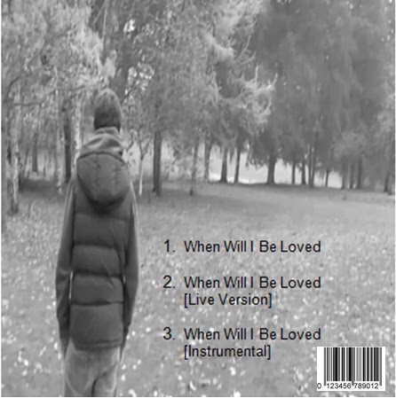
The CD page for our previous was red. This looked slightly out of place and a little bit too bright for the overall theme of the ancillary product, considering the majority of the product was in black and white. We altered the colours to make the product black and white. It looked a lot better and in my opinion slotted well into the theme and style of the ancillary products.
Looking back at the back cover of the digipak, it lacked detail that a professional industry standard digipak would definitely include. We added in a bar code at the back to increase the professionalism in the product. Also we included writing for the spine of the digipak to make sure we covered every detail a normal digipak would include. We made sure that the the background for the spine was grey and the writing black and clear for the audience to read. Plus this related well to our main theme of black and white which occurs throughout the ancillary products.
No comments:
Post a Comment